Amoeba Music
Information Architecture
Austin Community College
February-May 2024
Problem: The business goals were to increase online sales and increase in-store visitors. The client was known for offering a unique, explorative shopping experience with exclusive in-store events, but the website’s confusing navigation structure inhibited new customers from having this experience.
Approach: Content audits and card sorts were used to visualize the information architecture. New navigation paths were built into a prototype and tree testing was used to validate the design.
Result: New menu labels were written and organized to make it easier for first-time customers to make purchases and learn about the in-store events that made Amoeba Music stores iconic.
Content Discovery
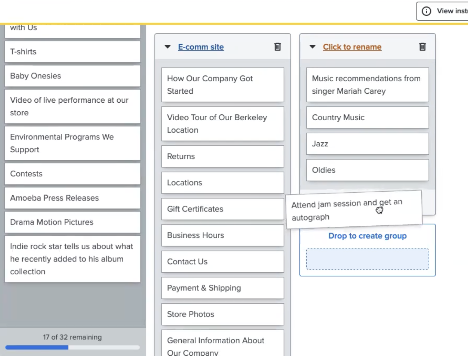
Open card sorts were conducted to understand how first-time customers interpreted existing content labels. A few ambiguous labels from the website had to be modified to help participants understand their meaning or to distinguish them from other similarly labeled content.
Example: “General Info” changed to “About Our Company”
Language was carefully selected to closely align with the original labels and their stylistic intent, but also clarify meaning for the card sort.

Click image to view

Sitemap Iterations
A sitemap was developed by analyzing results from the card sort. Data visualization tools such as similarity matrices and dendograms helped facilitate the analysis.
There were problematic areas that I had strong theories about, but I received feedback reminding me to justify each of my menu structure decisions using the data from my card sort. So, I put my personal ambitions aside and followed the direction of the data to inform my sitemap.
Prototype & Tree Testing
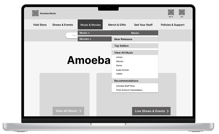
While building a prototype to test my new site structure design, I discovered a technical limitation that restricted hover states in my prototype, so my team lead and I discussed a work-around solution. The patch caused some occasional latency, but did not replicate consistently so I moved forward with the prototype.
The first test bombed.
I paused all testing and scoured support articles and Figma community posts to find a solution. Then I rebuilt the prototype to visually mimic the effect that I could not actually use and this reduced latency and freezing during subsequent testing.
Results & Insights
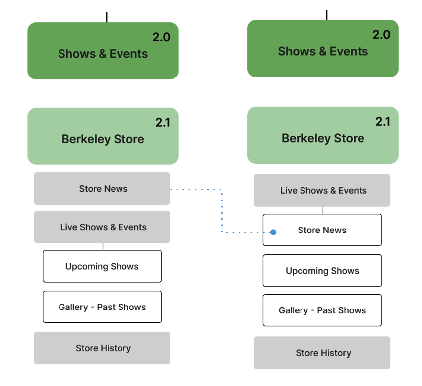
All participants successfully completed the usability test tasks, though there were two navigation labels that participants found to be a bit too similar.
One usability task revealed that users had trouble differentiating between two specific navigation labels.
Pre-testing feedback from design peers did not reveal this problematic aspect of the usability task, so it may have stemmed from being too close to the content while developing the test.
One hypothesis was to change the level of one of the pages so the two navigation labels wouldn’t compete and cause confusion, but the label one level above would also need modifications for the hierarchy to be logical.
Important insights can come from seemingly unrelated tasks.
One of the usability tasks asked participants what information they would use from the website to decide which store to go to in order to buy a certain item. This task was intended for users to find store hours and location for an in-person visit.
However, during the task, all users discussed how important in-store inventory availability would be in their decision to go to a store.
This is an important feature that connects online shopping and in-store visits, and important information that the client could consider for their business goals.
What I learned
Interviewing Skills
When I heard a heavy sigh or a frown combined with a long pause during tree testing, I took it as a cue to ask for the participant’s thoughts. I also learned to take a brief moment before I engaged participants in these situations to maintain a calm, neutral attitude.
Feedback from Design Peers
It can be difficult to maintain fresh eyes and imagine being a first-time user while working on the project over several months, so sharing my sitemaps and usability tasks with my peers provided invaluable feedback to then improve my prototype and interview questions.
Future Projects
Starting with a written outline of my sitemap makes it easier for me to visualize content hierarchies for a box-and-arrow sitemap. I habitually use outlines to structure my work in many different settings, so I started using this workflow preference for future sitemaps.